
Why colour choice changes what a field map tells you
A field map is a decision instrument rather than a picture, and the colour scale decides which zones an agronomist acts on. Perceptually ordered scales preserve the order of the underlying values, so a darker zone always means more rather than merely different. Scales built on red and green distinctions lose information in greyscale printing and are unreadable for readers with red-green colour vision deficiency, which matters when a map is used as evidence rather than illustration.
A map is an instrument, not an illustration
Every field map carries two sources of error. The first is measurement error — how well the satellite estimate matches ground truth. That gets a great deal of attention. The second is perceptual error — how much of the real variation a human can actually see in the rendering. That gets almost none, and it can be the larger of the two.
If a nitrogen map is accurate to within a few kilograms per hectare but the colour scale collapses a thirty-kilogram range into two shades that look identical, the practical resolution of that map is thirty kilograms. The precision exists in the data and is destroyed at the point of display.
What was wrong with the previous scales
The palettes we replaced had three specific problems, each of which affects decisions rather than aesthetics.
They were not perceptually ordered
Human vision does not respond linearly to colour. A ramp that steps evenly through a colour space in numerical terms will not appear evenly stepped, which means equal differences in the data show up as unequal differences on screen. Some parts of the range look highly differentiated and others look flat, even though the underlying intervals are identical. The reader systematically over-reads variation in some zones and under-reads it in others.
They failed in greyscale
Field maps get printed, photocopied, and pasted into reports. A ramp that varies in hue but not in lightness turns into a uniform grey wash, and the rank order — which zone has more, which has less — disappears entirely. Any scale intended for practical use has to carry its information in lightness as well as hue.
They excluded a meaningful share of readers
Around one in twelve men has some form of colour vision deficiency, most commonly affecting red–green discrimination. Ramps built on red-to-green transitions — the traditional default in vegetation mapping — are close to unreadable for those users. Given how many people in agronomy and field operations look at these maps, that is not an edge case.
What changed
All four products now use ramps that increase monotonically in lightness, so rank order survives greyscale reproduction and remains legible under the common forms of colour vision deficiency. The specific ranges were selected per product for the type of quantity being shown.
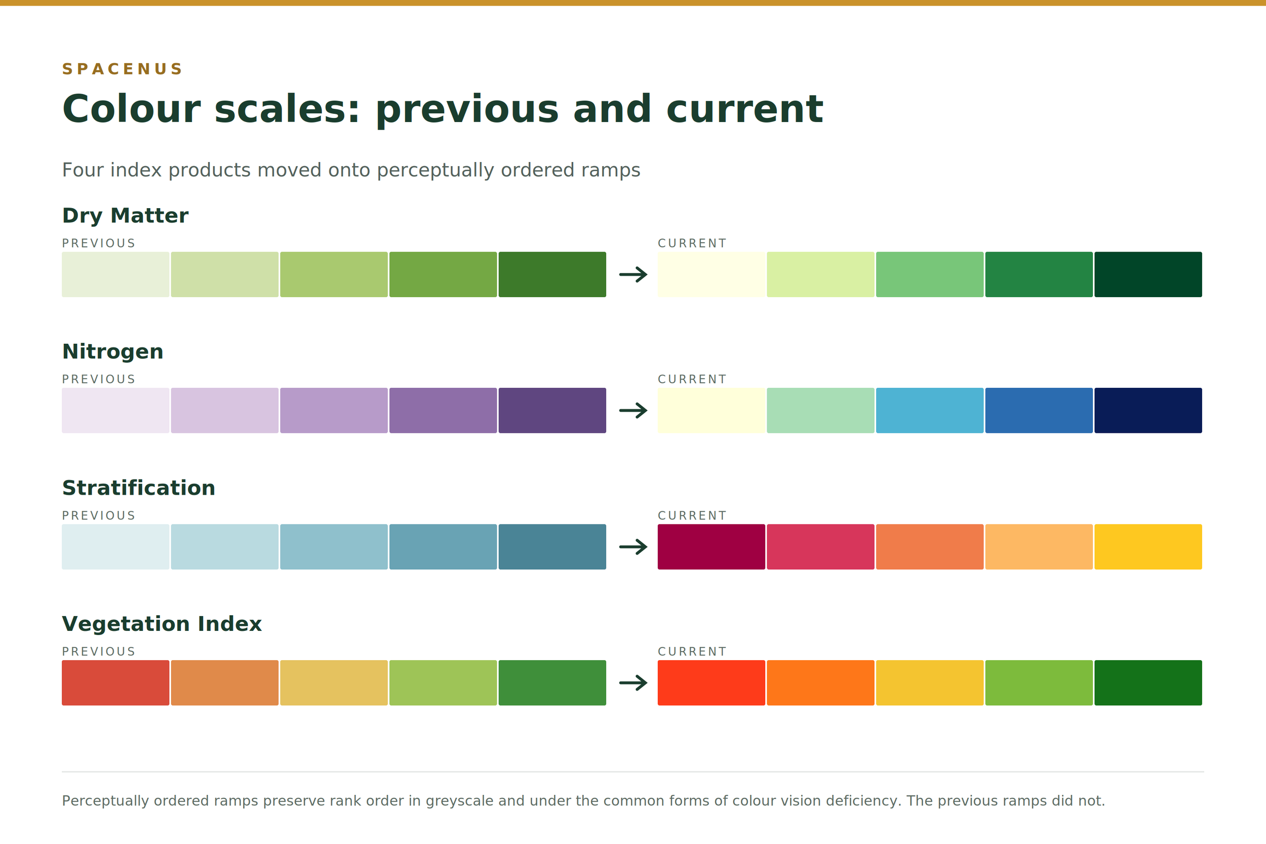
Dry matter runs from a pale yellow at low values through to a deep green at high values — a sequential ramp, appropriate because dry matter has a natural low-to-high ordering with no meaningful midpoint.
Nitrogen shortage and nitrogen uptake now share one ramp, from pale yellow to deep blue. Using the same scale for both means an agronomist reading them side by side is not switching visual reference between two maps of the same field.
Stratification runs deep red through to bright yellow. Because stratification zones are categorical rather than continuous, the ramp is chosen to maximise separation between adjacent classes rather than to imply smooth gradation.
Vegetation index retains a red-through-green progression, since users expect it, but the lightness now varies monotonically across the range so that the ordering survives both greyscale printing and red–green colour vision deficiency.
These are not brand colours
One clarification, because it comes up. The Spacenus brand palette and the map palettes are separate systems and deliberately so. Brand colours exist to make a company recognisable; map colours exist to make a quantity legible. Those are different jobs with different constraints, and forcing a map onto a brand palette would sacrifice perceptual accuracy for visual consistency — the wrong trade when the map is being used to decide where fertiliser goes. Map products use scientifically selected ramps. Everything else uses the brand system.
Why this matters beyond usability
There is a verification argument here that is easy to miss. If a map is used as evidence — to support a practice claim, a variable-rate prescription, or a sustainability disclosure — then how it renders is part of the evidence chain. Two people reading the same map should reach the same conclusion about which zones differ. A perceptually unreliable scale means they may not, and a disagreement about what a map shows is difficult to resolve after the fact.
Consistency across products matters for the same reason. When every index in a portfolio uses the same rendering logic, a reader who has learned to read one has learned to read all of them, and comparisons across indices become meaningful rather than approximate.
These colour scales are used across the Spacenus field map products, including the nitrogen and dry matter outputs behind ANA. If you work with field maps regularly and think a scale is costing you resolution somewhere, we would rather hear about it than not.
Common questions
Why not just let users choose their own colour scale?
User-selected scales make maps incomparable across fields, seasons and operators, which defeats the purpose when a map is being used as evidence. A fixed, documented scale means the same colour always means the same value.
Do the new scales change the underlying data?
No. The measurement, the model and the values are unchanged. Only the mapping from value to colour is different, which affects what a reader can see rather than what was measured.
Are the maps readable when printed in black and white?
Yes. All four ramps increase monotonically in lightness, so rank order is preserved in greyscale. This was one of the main reasons for the revision.
Which products use these scales?
Dry matter, nitrogen shortage, nitrogen uptake, stratification and vegetation index outputs, across both the web application and API-delivered map products.